Did you know, in Australia, 4.4 million people have a disability (source: Australian Bureau of Statistics)? That’s almost 1 in 5. Whether you realise it or not, people with disabilities will fall into your target market. It is important that your business caters to this demographic by having good accessibility information on your website.
Remember that accessibility doesn’t refer only to whether or not your building can be accessed by someone using a wheelchair. Making your business more accessible means considering the needs of people who have mobility needs, those with vision or hearing impairments and people with autism and other ‘invisible’ disabilities.
There are a wide variety of ways in which your business can make efforts to be more welcoming to those with disabilities. This article will focus on the changes that a small business can make to their online presence to better cater for different needs.
Having physical accessibility information on your website
If your business has a bricks-and-mortar location where you serve customers, you should be making your accessibility information available on your website. Even if your business is inaccessible via wheelchair, making this information available to your potential customers in advance is helpful. If you are able to offer an alternative solution for wheelchair users, this is your chance to tell them. If you can make alterations to the way in which you deliver your service to someone with specific needs, you should communicate this clearly on your website so that customers with those needs know in advance that they will have no issues while engaging with you.
Here is a list of questions that you can ask yourself about your businesses and your building. Use your answers to the below questions as a starting point for your accessibility page.
- Is your premises wheelchair accessible?
- How would someone with a disability get to your location?
- Are there disabled parking spaces nearby?
- Is your location close to public transport?
- Are there any stairs, steps or narrow passageways in your building that would make it difficult for someone with a wheelchair or mobility aid to move around? Are there any alternative routes to navigate your premises?
- Where there are steps are there handrails?
- Do you run any quiet and/or low-light periods for people who may be prone to sensory overload in noisy and busy spaces? If so, what days and times?
- Do you have any quiet spaces where someone can rest if need be such as a sitting area?
- Do you have a lift?
- Do you have wheelchair/ambulant bathroom facilities available?
- What is your companion card policy?
- Do you have any braille or tactile signage?
- What is your assistance dog policy?
- Are your staff are trained in working with customers with disabilities?
- Do any staff know AUSLAN?
- Do you have an inclusion statement?
Other resources that are helpful for people with mobility needs include:
- Photos of your premises (doorways, ramps, spaces)
- A digital tour of your premises
- A floorplan
These are helpful because people can gauge how well they will be able to move around in the space.
Making accessibility information accessible
Now that you have a list of all the information you can provide to customers with unique needs, how will you make this information available? While many businesses do have some information on their website about how they cater to clients with accessibility requirements, this information is often tucked away on their website making it difficult to find for those who need to know.
Ideally, your website should have a dedicated page for accessibility information. This should be linked in your website menu, from your content page, your FAQ page and your key product pages.
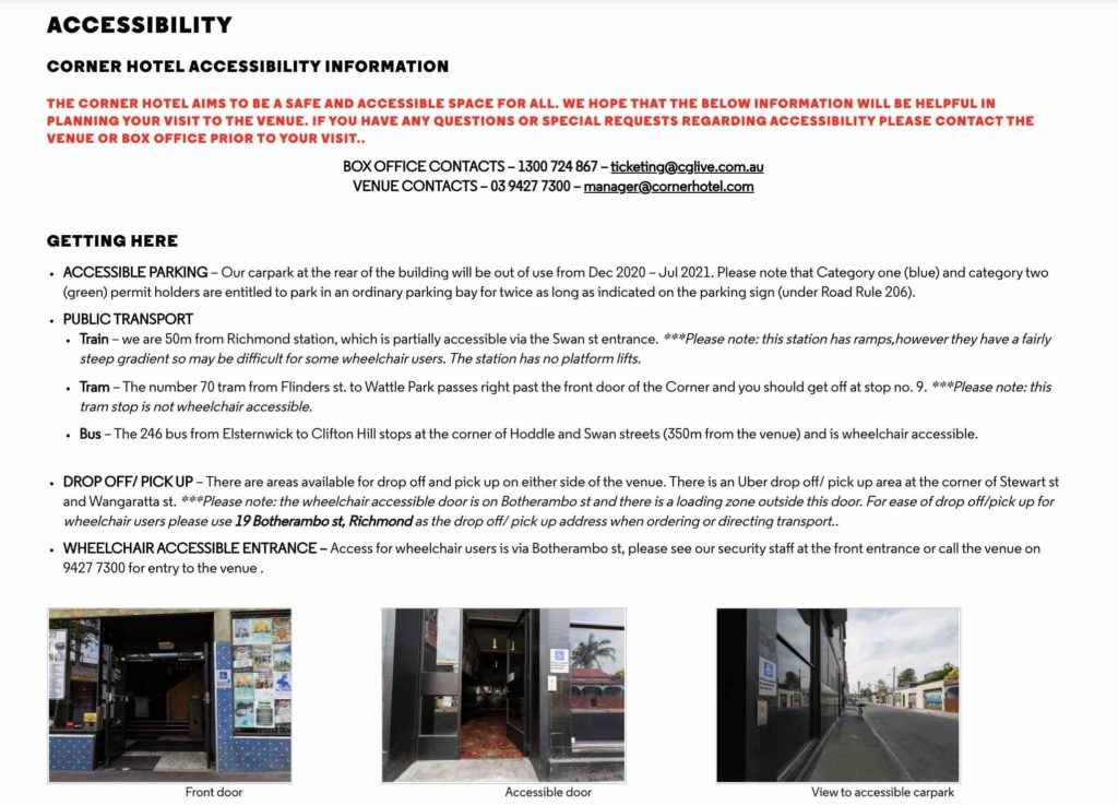
An Example of Accessibility information on a website
The Corner Hotel in Melbourne is a live music venue, bar and restaurant and they have done a brilliant job in making their accessibility information incredibly helpful and transparent.

Notable things that The Corner Hotel have included in their accessibility information:
- Information about parking, public transport access, wheelchair access, service dog policy, lighting, quiet spaces, companion cards, large print menus, and much more.
- Photos of ramps, entrances, potential hazards and quiet spaces
- Maps of each floor
- Downloadable information sheets that can be printed
- A virtual tour of the venue
Making your website more accessible
There are a couple of simple ways that you can make your online presence more accessible for people who may have low or no vision. As a bonus benefit for you, both of the below tips are great for your search engine optimisation (SEO).
Describe your images with alt text
People who can’t see or can’t see well, as well as those with cognitive or learning problems, benefit from image descriptions, often known as alternative text or alt text. Screen-reading software detects alt text and reads it out to the user. Without these image descriptions, someone using a screen reader may feel as though they have missed out on information that sighted people have access to.
Image descriptions should clearly and succinctly describe the content and the purpose of the image. If the image contains text this should be replicated in the image. If the image is purely for style/decoration on the web page, the alt text should describe it as “decorative”.
Use ‘true’ headings to clearly define sections of your content
True headings, also known as header tags, are the HTML, are elements of code used to divide a webpage’s headings and subheadings. They are ranked from H1 through H6, with H1 typically serving as the title of the page. True headings help people with vision impairments to understand the text as it was intended.
The example below shows what the code looks like in the left column and what the result looks like on the right.

People who are blind or have low vision will use screen-reading software to have web content read out loud to them. This technology relies on website creators and blog article authors using true headings in their text to differentiate between headings, sub-headings and paragraph text. If the person who wrote the copy (text) didn’t use true headings but instead made stylistic changes to break up their text (such as making text bold, italicised, a different colour or larger in size), the screen-reader won’t be able to differentiate these headings from the rest of the paragraph.
General advice for creating accessible web content
Below are some more tips that can and should be applied to small business website design in order to make your content easy to read and understand for an audience with a variety of needs and abilities.
- Use simple, sans serif fonts rather than a serif or cursive font
- Use colours for your text that clearly contrasts with the background
- Rather than using an image of text, use real text
- Try not to use very small font sizes
- All hyperlinks should be underlined and use a contrasting colour to the rest of the text it is grouped with
- Minimise unnecessary jargon and use inclusive language in your writing
- Expand acronyms on first use and wherever else is reasonable on each page
You can test the accessibility of one of your website’s pages by using this free tool by Siteimprove which will give you a report for individual pages of your site complete with a total accessibility score and explanation for each issue identified.
Extra resources
The information and recommendations presented in this article are by no means exhaustive but are a great start for any business owner who is looking to be more welcoming for people with disabilities. If you’re looking for more information about how your business can better cater to customers who have disabilities, the Australian Network on Disability is a great source of information. For tourism businesses, we recommend checking out Travelability and in particular their Accessibility Guide Workbook.


